
DON BRUNO ARCHIVE
Celebrating the Legacy of My Father’s Silk Screen Posters
My father was a master of silk screen printing, creating bold, unforgettable posters that became legendary in their own right. I wanted a place where his incredible work could be seen, remembered, and appreciated—a space where his artistry lives on. This collection showcases some of his most iconic prints in high resolution, preserving the craft and creativity that defined his work. Take a look, get inspired, and help keep his legacy alive. These posters are all 18”X24” or larger.


Blog post from New York Poster House - Feb 2025
Last summer, Poster House’s Executive Director and Chief Curator, Angelina Lippert, spent a week visiting Bruno Press in St. Joseph, Minnesota studying reductive printing under press owner and second-generation printmaker, Mary Bruno.
During this visit, Poster House acquired two selections of work from Bruno Press: a riotous batch of letterpress and reductive posters made by Mary Bruno in her characteristic irreverent style, and a surprise collection of silkscreened posters made by Mary’s father, the late Don Bruno.
Don Bruno founded a letterpress print studio Bruno Press in the mid-1980s, converting the family’s St. Joseph garage into a studio equipped with printing presses and type salvaged from local letterpress shops transitioning to newer printing technologies. Since his death in 2003, Mary has continued his legacy, using the same equipment in her own work.
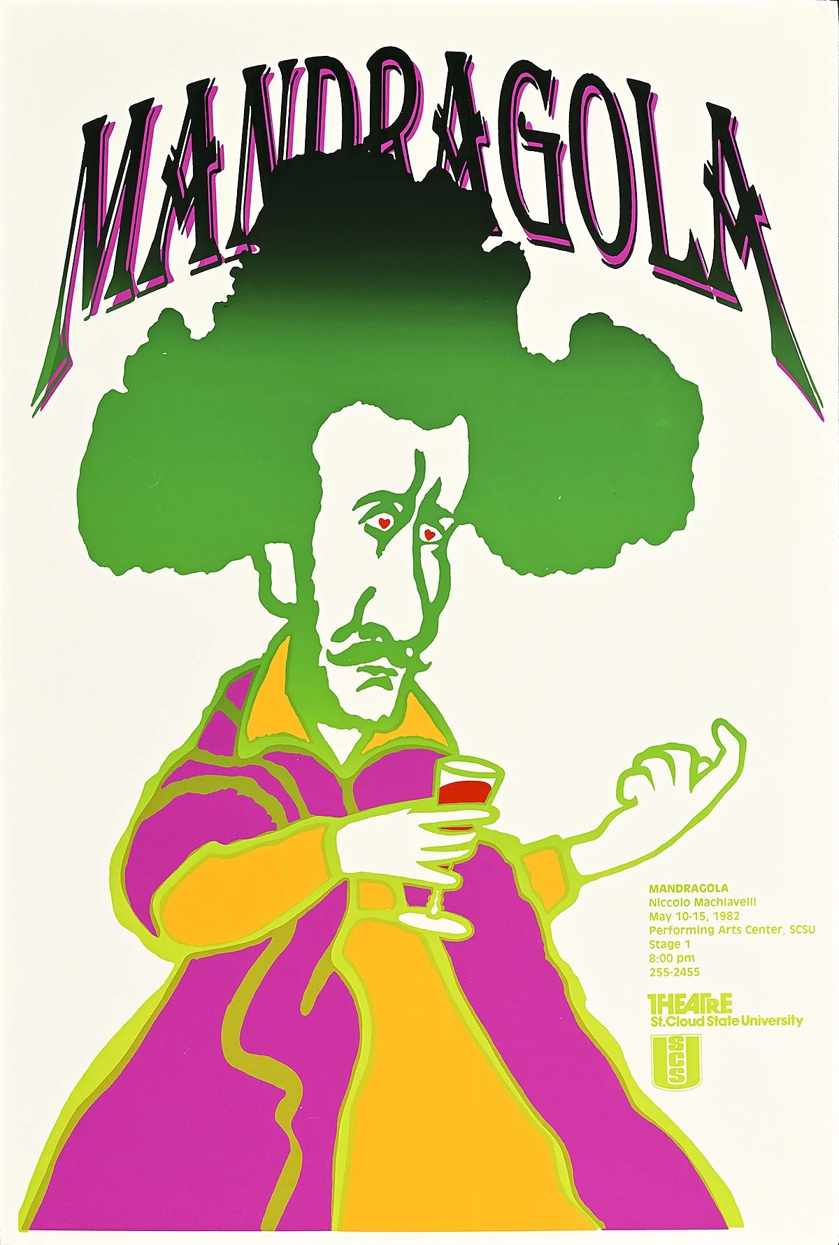
A renowned professor of art at St. Cloud State University, Don Bruno was commissioned in 1981 by Ron Perrier, then Chairman of the St. Cloud State Theater department, to design a set of posters for the department’s upcoming season. Bruno produced five silkscreens, now part of the Poster House Archive alongside thirteen others advertising subsequent shows.
The five posters for the 1981–1982 season cover a dizzying array of typefaces and gradients–each poster contains at least three colors produced in separate layers with unique screens. The technological complexity of the designs was such that some, like Hay Fever and The Good Woman of Sentzuan, took as many as four hours each to print in full. Rather than simplify, Bruno increased the scale of each poster and produced a limited run of only 125 posters.
Unlike many traditional advertisements for theatrical productions, Bruno’s posters do not depict scenes from the performance. His designs are decentralized and distilled to their essential nature; figures and text float dream-like on the non-real backdrops of silkscreened gradients and solids, removed from their narrative context. The posters themselves reveal little about the content of the shows they advertise. On some, like Beauty and the Beast, the central figure’s nondescript clothing makes her not immediately identifiable; on others, like The Good Woman of Sentzuan, the character can be placed recognizably within the scheme of the plot, but with a distorted face that retains a sense of ambiguity. Even the performance titles are subjects for distortion and play, with the names of the pieces reduced down to their bare forms in Fiddler on the Roof or obscured by figures and forms, as in Hay Fever.
Through this collective emphasis on abstraction, Bruno’s pieces communicate a complex relationship with one another across the department’s season. In interviews with the local student newspaper, Bruno underscored that this collective visual language was a priority: “I tried to make the posters look like they came from one person,” he said, in 1982. As the student interviewer observed, there was another critical element that unified the series—Bruno’s signature appears nowhere on any of the posters. According to Bruno, it would only get in the way. “I tried to make it into a strong visual statement. I wanted the posters to communicate rather than make an artistic statement,” he said.
Despite this modest intention, the season’s posters were met with rave reviews. “I can’t say enough about this,” Perrier, the departmental chairman and original commissioner of the designs said, following the conclusion of the season. “It’s the first time theater has had such a strong signature from show to show.” The student body population agreed. “I’m having a set of them framed and I plan to put them up in the green room—and have them screwed into the walls,” Perrier said. “People have been stealing the posters.”
Poster House is thrilled to add these pieces to our Permanent Collection, marking them as examples both of master silkscreen work and of the groundbreaking work of printers like Bruno working outside of the traditional centers of design—with or without screws to hold them into the walls.